My Texas Future is a web portal aimed at providing Texas students with a clear path to career opportunities through credential attainment. It facilitates students’ educational journey through comprehensive resources, actionable information, and data-driven recommendations for school-to-career paths. Deloitte Digital was commissioned to implement the very first launch of the My Texas Future website and career portal.
Problem
The problem that I was first directly responsible for solving was that the branding did not align with client leadership. Once The brand and style guide was established, the visual design needed to be consistent thought out the website and career portal.
Solution
I worked fast to turn around branding deliverables that better aligned with the clients vision. After getting sign-off on the look and feel, I created a design system that accelerated our design and development efforts.
My role
Website launch
Winter 2021 - Summer 2022
Visual design contributor & design lead, leading 1 visual designer.
Before I joined the My Texas Future design effort, the team had already completed key UX discovery work, including a competitive analysis and user research. On the visual side of the effort, a branding workshop had aligned the team and client on style and identity, but when client leadership reviewed it, a problem emerged: it didn’t look 'Texas enough.' This is where I was brought onto the effort to swiftly elevate the previous branding to better suit the needs of the client.
Logo refresh
Logo refresh
Exploration
As the exploratory phase wrapped up and stakeholders anticipated deliverables, we needed a very quick turnaround on a logo design. I saw this as an opportunity to generate excitement around the new Texas-forward identity. To create a bold and more Texan look for MTF, I incorporated “TX” instead of “Texas” and used shapes reminiscent of the Texas flag and traditional Texas license plate, to reflect iconic Texas attributes.
Selection
The bolder approach was very well received, but stakeholders were also pushing for a logo that still read as modern. So, we introduced the square mark for a more simple and approachable take.
Brand attributes
Brand attributes
Styling choices
Creating a more distinctly Texan aesthetic required bolder, more impactful design elements. To achieve this, I introduced a more saturated color palette and a sans-serif typeface. While the bolder take on the logo was well-received during the logo exploration, it was essential to maintain some continuity with the previous branding to ensure stakeholders felt heard. To achieve this, we preserved the hand-drawn, scrappy decorative elements, reflecting the creative direction established during the brand workshop.
Design system
Design system
Style at scale
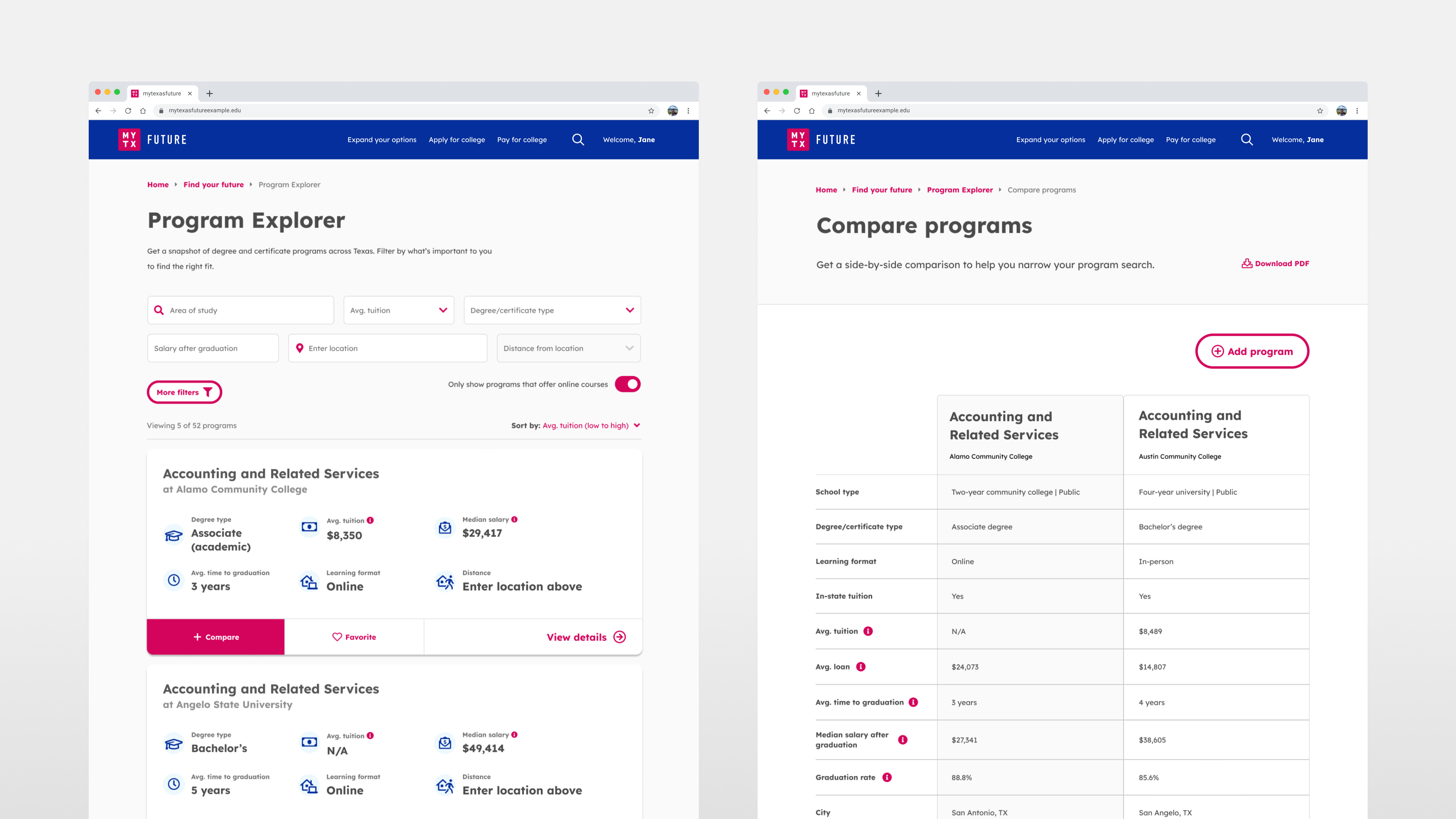
As this was the first implementation of MTF, the design system was built from the ground up with custom solutions designed for scalability and accessibility. A key feature was a template-based CMS library, enabling admins to create unique pages by utilizing custom, pre-fabbed content blocks.
Delivery
Delivery
Applying the brand
As the lead for the visual design effort, I provided mentorship to a senior designer while actively contributing to the design process. Working iteratively with client and internal stakeholders, the design team fostered collaboration across UX, Product Management, and Development teams by facilitating idea-sharing workshops and review sessions.