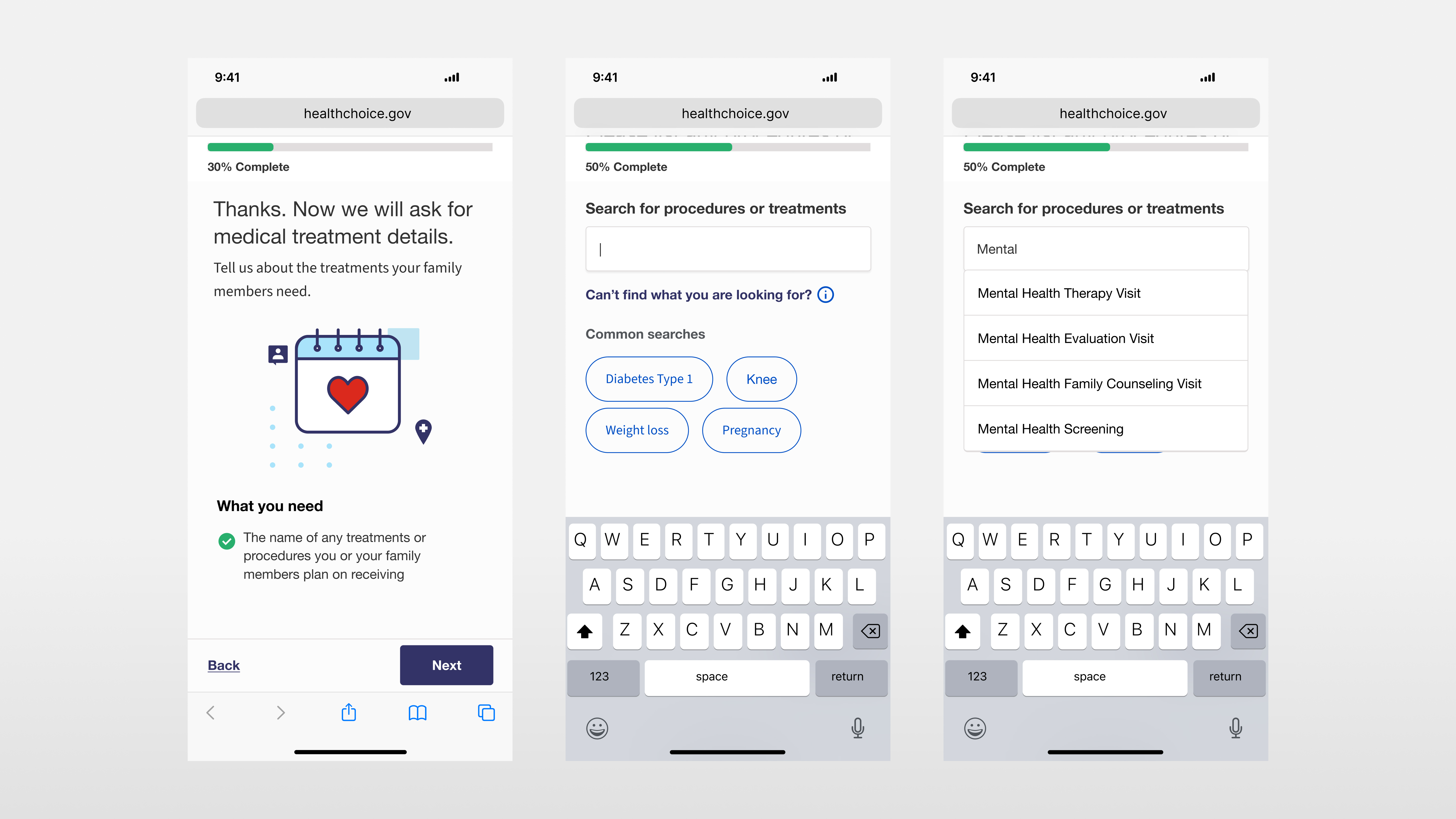
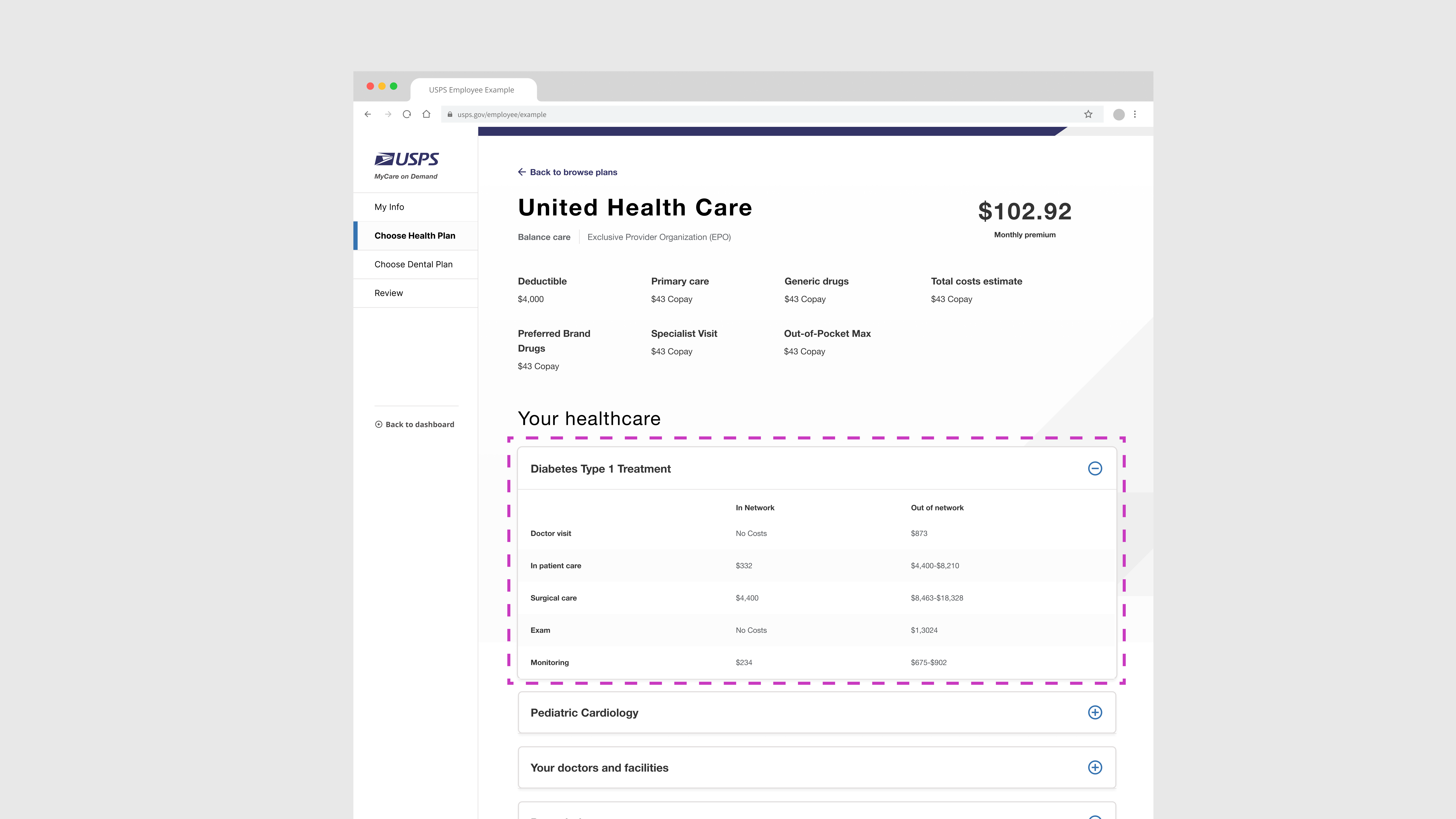
United States Postal Service
Employee health benefits enrollment portal
About
Deloitte Digital was contracted to create an open enrollment web portal for USPS employees and retirees for the 2025 enrollment year. The Digital team worked iteratively with USPS to create a user-centered portal by conducting extensive usability testing, providing research findings, and working closely with stakeholders to align on solutions that not only help users compare health plans, but also provide opportunities for education—empowering them to select the most cost-effective plan with greater confidence.
Problem
The design team was tasked to find the biggest issues within legacy system to prioritize for sprint cycles. Once issues were identified, design solutions needed to be signed off by client and brought to the development team for implementation.
Solution
I led the team to leverage usability testing so we could bring validated solutions to USPS and give our development teams specifications on the features and new updates they needed prioritize.
My role

Redesign and first launch

Winter 2023 - Summer 2024

2026 enrollment updates

Fall 2024 - Current
Platform features

Search and add providers

Users can add their current doctor information, or search and add new doctors. Coverage for each doctor can then be seen when selecting a plan.

Search and add prescriptions

Users can add prescriptions for each of their family members, then see the cost breakdown for each prescription when selecting a plan.

Search and add treatments

Users can access the most relevant healthcare information by entering specific procedures and treatments tailored to their own needs and those of their families.

Browse and compare plans

Users can add mutilpe health plans to a que where they can then compare the details for each.
Where it started

Challenges working with a legacy system

The biggest challenge in leading the design effort for USPS was delivering a user-centric solution within the confines of an internal legacy system that served as the base platform for our team to enhance.

The screenshot below demonstrates how the legacy solution required users to remove a dependent in the case of changes to their family status. The only way for users to remove a dependent was to navigate through the dashboard to their settings, where they would then have to click the "Remove" link paired with a trashcan icon.
Project planning

Milestones

To be sure we hit all of our milestones, I worked with project managers to plan to stagger our work efforts between usability testing, design system updates, and final compositions to help get a high-level view of how I could delegate tasks between our team of three.
Usability testing

Testing the legacy version

We anticipated friction throughout the experience, but testing the legacy version provided valuable insights to build a strong case for prioritizing updates during internal planning, and client discussions. To ensure meaningful user feedback, we partnered with USPS to facilitate usability testing with current and retired postal workers.

98

QUOTES
CAPTURED

04

THEMES
IDENTIFIED

32

UPDATES
ADDED

Provider search feature

Problem

The legacy interaction required users to enter information at the top of the page, then make a selection further down. During testing, we observed users struggling to scroll up and down repeatedly to add doctors and facilities to their search.

Again, I don't know all the scrolling up and down you have to do.

- USPS Retiree

Didn't I already select a doctor? It's confusing these cards appear with selected doctors underneath the search results.

- USPS Retiree

Solution

The solution we provided, after considering user feedback, identifies two distinct use cases when searching for a new doctor or care facility: entering current doctor information or finding new doctors.

This enables users entering current doctor information to have a more simplified experience, while users looking for new doctors benefit from a design that surfaces more information about doctors. Each solution keeps interactions above the fold on both desktop and mobile versions.
Adding Your current doctor information
Features
  • Identified as the interaction the majority of users will select.
  • Leverages a simple type ahead for entry.
  • Zip code and medical specialty can help narrow search.
Adding new doctors
Features
  • Features search, then search results page.
  • Surfaces ratings, gender, location, and if doctors are accepting new patients.
  • Map view is shown along side results, toggles between list view on mobile
Health plan details

Problem

When users are browsing and comparing plans, they have the option to access more plan details, which brings them to a dedicated plan details page. During testing, we found that while this page in the legacy version had a lot of information, users struggled to find what was relevant to them.

The legacy details page featured a laundry list of treatment costs, and we observed users scrolling through it without much care for any of the details.

Wow that's giving a whole lot of information. It's a shame we are left to figure all of this out ourselves.

- USPS Active Employee

There's a lot to read and take in here.

- USPS Retiree

Solution

The solution proposed and implemented allows users to enter the specific medical care they find important for themselves or their families. Their entries are then reflected in the details of each plan. We believed this would significantly improve the user experience by moving away from a long list of generic costs and instead showing how coverage applies to the treatments they need.
Design pillars

Education

Many of the health plan comparison tools out there are cluttered with tooltips, each providing only a few sentences to explain important health plan details. HealthChoice offers ample educational opportunities by surfacing helpful content directly on pages or in large quarter-page modals. Tooltips are used sparingly and only when more detailed information is relevant.

Identifying the opportunity to educate users throughout their experience—and making it one of our primary pillars—aligned our internal teams and clients around a shared vision.

Guidance

An important value for our teams is to guide users throughout the entirety of their health plan selection process. A great way to stay true to this value is by breaking content into smaller steps, rather than having users scroll through long pages.

One 👏 step 👏 at 👏 a 👏 time

By leveraging a questionnaire template, users can customize their experience through logic trees in flows where specific information is required. No longer do users need to manage their family members through a dashboard.

Personalization

Enabling users to input their own personal health treatments empowers them to see more relevant information regarding the cost-effectiveness of health plans.
Results

18% decrease in call center volume

Once the open enrollment season was over, reports showed that call center traffic dropped by 18%. Case workers also noted far fewer complaints regarding the new open enrollment system.

12% increase in retiree engagement

A customer satisfaction survey showed a substantial increase in engagement with retirees using the updated system.
Final Thoughts

Future efforts

In this case study, I highlight the redesign of two key features in the enrollment portal: the Customer Decision Support Tool (CDST) and the Qualitative Life Event Flow (QLE). These features underwent the most significant updates, as usability testing allowed us to prioritize them for improvement. Due to a tight timeframe and limited development resources, we leveraged the legacy system to support the dashboard connecting these flows and others.

Looking ahead, I hope to further enhance the dashboard for a more user-friendly experience.
Hello, I'm still working on the mobile version of my site. If you would like to see my work, please view it on a desktop screen.

Thanks for you time,
- Adrian