Jovio

Branding
UI
Design Systems
Micro-Interactions

Branding

Product Design

the challenge

Build a visual identity system from the ground up to support Jovio as a new startup that is competing in the central Texas tech real estate market. The brand’s identity also needed to extend to the UI of Jovio’s web app to give consistent look and feel. Additionally, the web app needed to leverage design practices and be implemented on a quick timeframe. Both brand and product initiatives were happening simultaneously, so the need to time block was crucial to meeting asset deliveries.

my role

  • As the sole design resource of a new startup, my responsibilities included ownership of Jovio’s brand identity system, design assets for advertising, digital product design, and Jovio’s marketing website design and development built in Webflow.
  • Daily work included supporting both marketing and development teams simultaneously, working within tight time-frames and agile workflows.
  • Managing and growing the design team to include a junior designer. I worked closely with our junior designer as a mentor through delivering design assets, technical training, and design critique.

Brand Exploration

brand voice workshop

team input and affinity mapping

If we were going to build a strong identity, we first needed to figure out what values defined us. To accomplish this, I gathered stakeholders and leadership together to do an affinity map exercise that would help bring clarity to what our values are.

workshop synthesis

As the workshop continued, the whiteboard was overflowing with post-its defining all of the great words and phrases that represented Jovio. I then challenged the group to narrow down the words and phrases significantly to get everyone one aligned to the idea that as an identity, Jovio can only represent so much. These are the terms and phrases we narrowed it down to:

How it feels

  • Enlightening
  • Empowering
  • Different
  • Compelling

Key Messaging

  • "Unlock Ownership"
  • “The Jovio Movement: A transformation of the real estate industry”
  • “The Jovio way”
  • “Take the mystery out of real estate”

Brand Assets

Color

shades of green

Jovio’s CEO had a specific green tone that he liked already and he was firm on the fact that he wanted to keep it. We liked the green tone as it felt unique, but the color by itself was completely inaccessible when working with type and interaction instances like buttons. I introduced a palette with teal shades to help give Jovio Green better context and make it easier on the eyes, which also gave us tones that would be more compliant in applicable scenarios.

typography

Friendly, yet professional

Gilroy fit our friendly, yet professional persona and it’s contrast between roundness and sharp geometry felt consistent with other visual elements of the brand. Gilroy worked great in large display scenarios and also in paragraphs, so it was an easy choice for us to move forward with.

Mosiac Element

bringing everything together

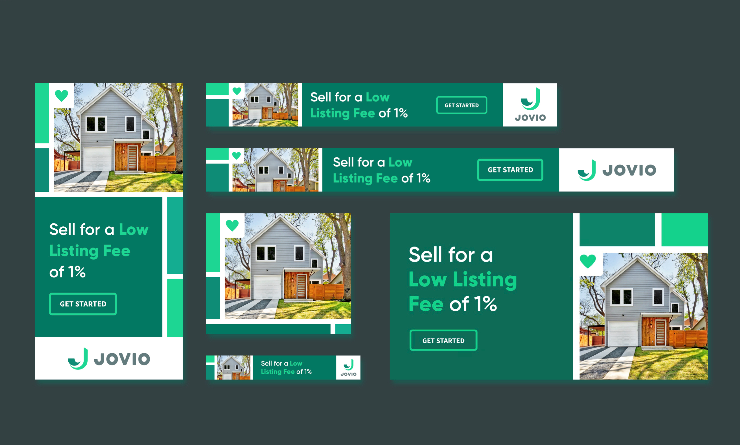
“Mosaics” were our solution to fit photography, text, and illustration together. The continuation of negative space gave a feeling of motion while the shapes that formed gave a sense of stability. Not only did the treatment visually match the vibe of our voice and tone, but it also gave an excellent opportunity to bring visual elements together inside a grid.

UI Design

Design Challenges

information hierarchy

A big task for our team was predicting what information would be the most critical for our users when looking for homes. There were dozens of attributes to consider what the user's hierarchy of needs might be including price, location, square footage, and listing photos.

user retention

Our research determined that home buyers often spend months browsing homes before finally wanting to take a home tour. Buying a home can be one of the most critical decisions in someone's life, so our release needed to include features that could keep users engaged over longer durations while considering their options.

setting the stage

research and platform

The Jovio Marketplace leveraged a templated platform for real estate product design where we layered in custom UI and found opportunities to improve the user experience.

Our research included conducting several heuristic analysis's of industry leaders with similar offerings to ours, and leveraging the most common trends that suited our design requirements.

Design Iteration

Prototyping with origami studio

Our design sprints moved quickly, so collaboration was an essential part of our design process. Our team had limited resources for research so much of the influence for validating ideas came from internal team discussions and reviews of low fidelity mockups.

In later stages, high fidelity prototypes proved to be an excellent way for stakeholders to interact with a fleshed out interactions that reacted to input. Prototypes also gave developers more detailed examples of how we intended interactions to work.

Retrospectively, I would have avoided designing the screen-swipe microinteraction for screen transitions, as that is a native interaction to mobile apps.

I created prototypes with Origami Studio, a prototyping tool that enables interactions and real-time animation rendering.

interaction Design process
1/3

MAP/LIST SWITCH

Sketches A & B show options for how users would toggle between the two property viewing options; the map view, and the list view.

We considered option B because at the time Airbnb used a similar interaction where users pushed the wayfind icon to access the map and then used the X button to return to the list. After our review, we decided on option A to lessen the cognitive load for users. It made sense to leverage one interaction pattern, as opposed to having two separate instances of buttons.

Options:
Solution Prototype:
2/3

MAP INTERACTION

For the map view, we had to consider how much information to display on the property cards and how we would work with limited space on the mobile version. Option A retained more visual patterns of the original listing card while option B rendered a more stripped-down card with the price moved inside the wayfind pins on the map. We liked option B and thought the cost of creating new components was worth a better experience for the user.

Options:
Solution Prototype:
3/3

JOVIO LISTING FEATURE

The four sketches explore where to place a label to mark properties listed by Jovio. An original objective for our team was to market more properties listed by Jovio, but these iterations made us consider the importance of this feature to the user.

We concluded that marketing Jovio listings were a business need, but not something that would fulfill any user needs. So, we decided on option D because it played down the Jovio Listings feature the most.

Options:
Solution Design:
User flow
1/3

DASHBOARD FLOW

These examples show options for users to navigate to our dashboard. The first options show ideas stakeholders had to allow users to navigate to a "locked" dashboard that would let them see, but not utilize features until they sign up. The locked features would ideally encourage people to sign up after they find out about the features they can get. The second option suggests a more straight forward sign-up flow that excludes the locked dashboard experience.

We decided to move forward with the second option because we saw too many opportunities for a locked dashboard to confuse users.


Options:
2/3

SIGN UP/LOG IN

After we approved the dashboard/signup flow, we were able to abstract our sign up and login patterns. We could then apply those patterns when users wanted to save a search or favorite a property.

I worked with our Junior Designer to create the modal screens for each flow.

Solution Prototype (dashboard/sign up flow):
3/3

DASHBOARD INTERACTION

Once users have signed up, they're able to access their saved searches and favorited properties in their user dashboard.

This dashboard experience was our solution for the challenge of retaining user activity over a longer decision-making period.

Solution Prototype(dashboard logged in flow):
Interaction Details
1/2

PROPERTY CTA

This interaction places the CTA only at the moments where it is relevant for the user on a property page. Creating a prototype allowed us to demonstrate how we could clean up visual clutter for users by hiding the CTA component once users have scrolled past property information.

2/2

PROPERTY CARD

The listing photo slideshow was one of the more complex interactions scoped out for our developers to produce. This prototype was built to show every detail necessary for production, so there would be no discrepancies between the design and the finished product.

The left and right arrows trigger both the slideshow and the scroll animation at the bottom of the photo.

Design System

Having a design system as a part of our sprints enabled us to have clarity maintaining UI and UX patterns. Not only did we have the ability to organize and update components, but the rules and guidelines we created for styling and production made collaboration with our developers that much easier.

education and collaboration

Working with a design system was a fairly new concept to our developers and Jovio's internal stakeholders. So, along with delivering UI patterns, outlining and annotating the reasoning for why we made decision's was just as important.

The diagram image below shows how we treated drop shadows. In our design system we assessed different layers for shadows for a more realistic sense of depth/ This helped us to better juxtapose the hierarchy of our UI in our compositions.